Power BI reporting shaped around the decisions your team needs to make. We bring together dependable models, clear measures and visualisations that make complex information easier to explore.
A useful report starts with clear definitions. We develop semantic models and calculations that make the relationships, reporting periods and business rules explicit.
Semantic modelling and relationships
DAX calculations and reusable measures
KPI definitions and model documentation
02
Give the detail a clear shape.
Bring performance, pathways and geographic comparisons into view. Custom visualisations help explain the story when a standard chart is not enough.
Executive scorecards and operational dashboards
Deneb visualisations and drillthrough
Pathway, conversion and waiting-time analysis
Site, catchment and competitor comparisons
03
Improve the reporting you already have.
We can review existing reports with your team to identify confusing measures, difficult navigation and opportunities to improve the model. Agree the review scope and priorities before development starts.
Model, calculation and report usability reviews
DAX refactoring and report development
Documentation, handover and agreed ongoing support
From information to action
A clearer view, in practice.
Executive performance, complex pathways and geographic comparisons. Explore some of the questions our reporting and analytics can help you answer.
Illustrative examples with synthetic data, showing the types of reporting we develop.
01 / Performance
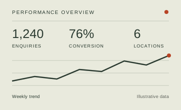
One view of performance.
Where do we need to focus?
Bring key measures, trends and comparisons together in an executive scorecard. Move from the headline to the detail behind it.
Shared KPI definitions
Performance against a target
Drillthrough to supporting detail
02 / Pathways
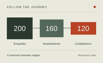
Understand every stage.
Where does progress slow down?
Follow a referral, service or customer journey. Explore conversion between stages, waiting points and reasons for dropout.
Stage and cohort comparisons
Conversion and dropout analysis
Custom visuals for complex journeys
03 / Geography
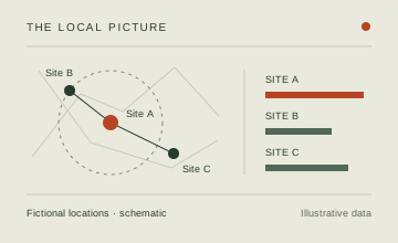
See the local picture.
How do locations compare?
Explore site performance, catchments and proximity. Put geographic context alongside your measures to understand patterns across locations.
Tell us about the reporting you have today and the decisions you need it to support. We can discuss a new build, improvements to an existing report or a scoped Power BI review.